Message Box - Transient
Description
Display a temporary message that can be dismissed using a button or automatically after a period of time.
Discussion
A transient message is a message that is displayed for a short time and then automatically is hidden (unless the user dismisses the message early, by clicking a close button).
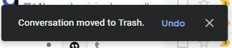
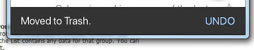
Transient messages are used extensively by Google in their applications (for example in the GMail web and mobile applications). In the two images below, the transient messages in the Gmail web and mobile application are shown.
To create a Transient Message in the UX or Grid, define a new Action using Action Javascript and select the Message box - Transient action
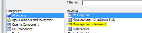
The builder is then shown:
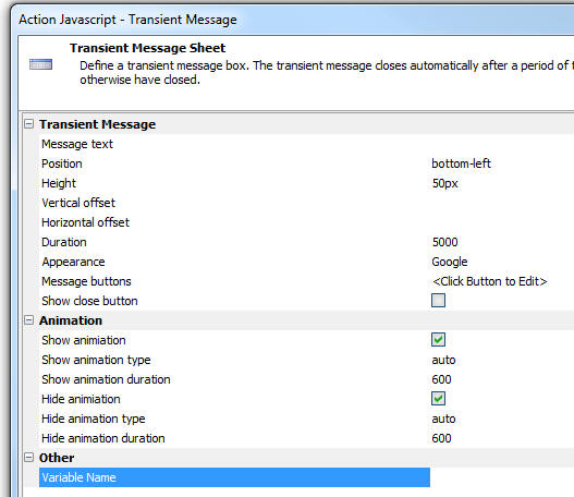
Properties that can be set in the builder include:
- Property
- Description
- Message text
The HTML text to display in the transient message
- Position
The position of the message. A transient message can have the following positions:
- top - top, center of the screen
- top-fill - top of screen (expands to full width of screen - typically used in mobile application)
- top-left - top left of screen
- top-right - top right of screen
- center - center (horizontal and vertical) of screen
- bottom-left
- bottom
- bottom-fill
- bottom-right
- dropdown - below another element
- dropdown-left - below left edge of another element
- dropdown-right - below right edge of another element
- inside-existing-transient-message - used when you want to display a transient message in the same window as another transient message. For example, an initial transient message might have the text Working.. and then you might want to replace that message with another message saying Operation complete.
- Height
The message window height (in pixels). Leave blank or set to <Default> to use the default height. The default height is just enough to accommodate the message text and any buttons (if any).
- Vertical offset
Distance in pixels from the top or bottom of the screen.
- Horizontal offset
Distance in pixels from the left or right edge of the screen.
- Duration
Time (in milliseconds) before the transient message is automatically closed. Set to -1 to never automatically close the message (user will have to press the close button)
- Appearance
Options are Google, Default, Custom. If you select Google, the transient message styling is similar to styling used by Google in their applications. Default styles the transient message based on the currently selected component style (e.g. Alpha, MobBlue, etc.). Custom allows you to specify a CSS class and in-line style for the message window.
- Message buttons
Allows you to define one or more buttons to appear in the message body. For each button you can define the Javascript to execute when the button is clicked. You can also specify if the button appears before, or after the message text.
- Show animation
Specify if the transient message is animated when it is shown
- Hide animation
Specify if the transient message is animated when it is hidden
- Variable name
(Optional). Specify that name of a variable that will be set when the transient message is shown. This variable will contain the name of the window in which the transient message is shown. This option is only used if a subsequent transient message is shown with a position of inside-existing-transient-message.
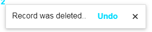
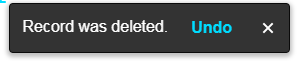
The images below show a transient messages in the UX component using the Google and Default appearance:
The minimum amount of Javascript to display a transient message (using the Default Appearance) is shown below:
{dialog.object}.transientMessage('center','Record was deleted.',
    {
        buttons: [{html: 'Undo', onClick: function(){alert('undo')}}]
    }
)
See Also